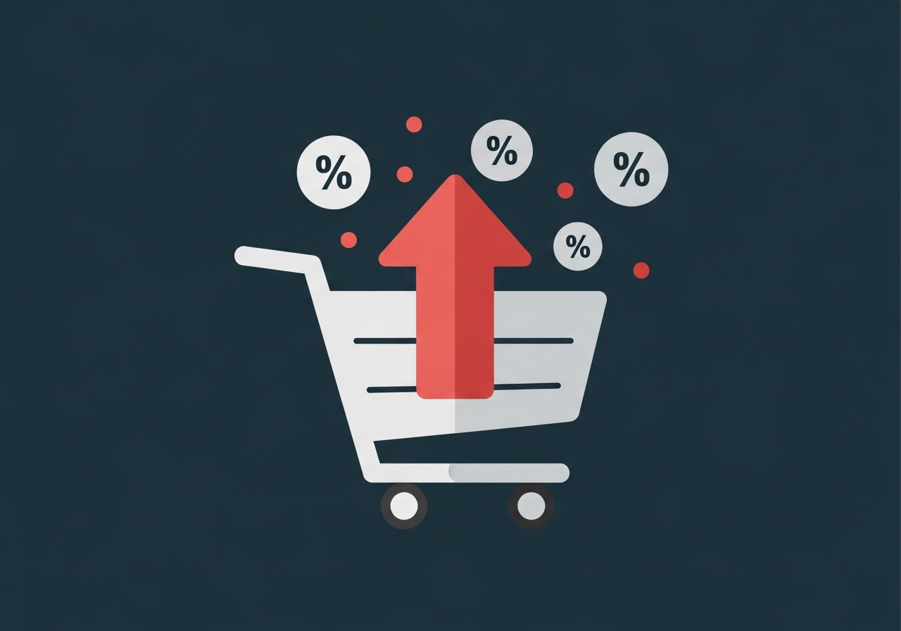
Ecommerce brands spend $92 on customer acquisition for every $1 they spend on conversion rate optimization. That ratio, documented by InvespCRO's industry research, explains why most DTC brands have a traffic problem that is actually a conversion problem. They are paying to bring visitors to stores that are structurally set up to lose them.
Ecommerce conversion rate optimization services are the systematic fix: research, testing, and design work that improves the percentage of visitors who complete a purchase. A documented CRO program produces an average 223% ROI, per We Are Tenet's CRO statistics. At a 2.5% baseline conversion rate, a 30% relative improvement on a $10 million annual revenue store is approximately $300,000 in incremental annual revenue without adding a dollar of ad spend.
Before evaluating CRO services, it helps to understand where your store sits relative to benchmarks. Littledata's study of 2,800 Shopify stores puts the platform average at 1.4%. The top 20% hit 3.2% or better. The top 10% reach 4.7% or better. Top performers exceed 11%.

The spread is not random. Traffic source has an outsized effect on conversion rate. VWO's ecommerce conversion research shows email traffic converting at 4.0% to 5.3%, organic search at 2.7%, and paid social at approximately 1.5%. Brands that run paid social as their primary acquisition channel are starting with the lowest-converting traffic type and often misattribute low conversion to creative or audience problems when the real issue is site experience.
Cart abandonment data from Baymard Institute adds the most actionable context: 70.19% average abandonment rate, with mobile abandonment at 85.65%. The top five abandonment triggers are unexpected extra costs (39% of cases), delivery time objections (21%), trust issues with credit card entry (19%), forced account creation (19%), and checkout complexity (18%). Baymard's large-scale checkout research found the average large ecommerce site could achieve a 35.26% increase in conversion rate through better checkout design alone, representing roughly $260 billion in recoverable lost orders across US and EU ecommerce.
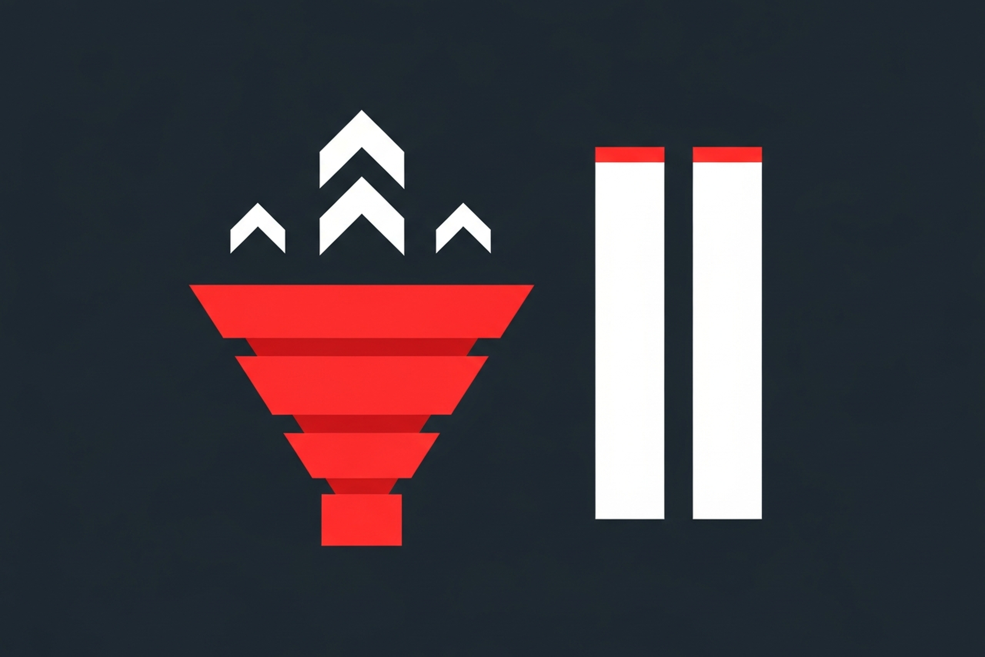
A complete ecommerce CRO engagement runs through five phases that most brands do not execute independently.
Agency pricing for ecommerce CRO runs on a wide range that tracks closely with the scope of testing and the size of the client's traffic base. We Are Tenet's pricing data shows growth-stage brands paying $2,000 to $5,000 per month for a full retainer engagement, with enterprise-tier programs running $8,000 to $31,000 per month.
Project-based engagements for standalone audits run $2,800 to $85,000 depending on scope and agency tier. The audit-to-retainer path is common: brands commission an audit to understand their conversion gap, then convert to a retainer once the opportunity size is clear.
The in-house team alternative is rarely the cost-effective option at growth stage. A minimum viable internal CRO team (CRO manager, UX designer, data analyst, front-end developer) runs $420,000 to $650,000 annually in salaries, benefits, tools, and training, per Elsner's in-house vs. agency CRO analysis. The break-even point for hiring in-house is typically above $50 million in revenue with 200,000 or more monthly conversions generating enough volume to sustain 20 or more experiments monthly.
Several questions reliably distinguish genuine testing-and-optimization programs from design-plus-copy rebrands.
Ask specifically: what experiment generated the most revenue for a brand similar to mine, and how do you measure that? A CRO agency that measures success in conversion rate percentage rather than revenue per visitor is optimizing a metric that can be gamed. Moving low-quality traffic off the page improves conversion rate without improving revenue. The right metric is revenue per visitor.
Ask how they handle statistical significance. Agencies that run tests for arbitrary two-week windows and declare winners without reaching required sample sizes are producing noise, not signal. A competent answer references minimum detectable effect sizes, required sample calculations, and sequential testing methods.
Ask whether checkout and pricing pages are in scope. Checkout is where 35% of improvable conversion opportunity lives, per Baymard's research. If a CRO agency treats it as out of scope, they are avoiding the highest-impact surface in ecommerce.
Ask for an example of a test that failed and what they learned from it. Good CRO agencies have extensive loss libraries. Agencies that only show winning case studies are either cherry-picking results or have not been running programs long enough to accumulate meaningful learnings from failures.
The ten red flags documented by Logiciel's CRO agency evaluation guide are worth reviewing in full. The most consistently problematic: pitching tools before discussing strategy, optimizing for test volume rather than impact, and reporting on engagement metrics rather than revenue outcomes.
The traffic threshold matters. A/B tests require sufficient sample sizes to reach statistical significance within a reasonable testing window. Brands with fewer than 5,000 monthly sessions face a practical constraint: low-traffic stores cannot run valid tests fast enough to justify a full retainer program. The better approach at that stage is qualitative research and heuristic audit work, implemented as best practices rather than tested sequentially.
Above 10,000 monthly sessions, an ecommerce CRO retainer produces measurable results within two to three months. Above 50,000 monthly sessions, a full testing program running six to twelve experiments simultaneously generates compounding improvements across the funnel. The math favors CRO investment heavily: a $3,000 monthly retainer that improves conversion from 2.5% to 3.25% on a store generating $500,000 monthly revenue produces $30,000 in incremental monthly revenue, a 10:1 return.
For growth-stage ecommerce brands investing in paid acquisition while their conversion rate sits below the top 20% benchmark of 3.2%, the sequence is clear. The dollars spent acquiring traffic to an unconverted store are partially wasted. Every percentage point of conversion improvement compounds across every future acquisition dollar spent.
Ecommerce CRO services close the gap between traffic investment and revenue return. The $1 to $92 spend ratio across the industry means most brands are dramatically underinvested in conversion relative to acquisition. The documented 223% average ROI and Baymard's 35.26% checkout improvement benchmark both point to the same conclusion: for brands between 10,000 and 200,000 monthly sessions, a well-run agency engagement is likely the highest-leverage growth investment available.
For DTC and ecommerce brands building performance programs that connect paid acquisition economics to site conversion, EmberTribe works at this intersection, ensuring that demand generation spend lands on optimized experiences rather than leaking through unclosed funnel gaps.
Ecommerce brands spend $92 on customer acquisition for every $1 they spend on conversion rate optimization. That ratio, documented by InvespCRO's industry research, explains why most DTC brands have a traffic problem that is actually a conversion problem. They are paying to bring visitors to stores that are structurally set up to lose them.
Ecommerce conversion rate optimization services are the systematic fix: research, testing, and design work that improves the percentage of visitors who complete a purchase. A documented CRO program produces an average 223% ROI, per We Are Tenet's CRO statistics. At a 2.5% baseline conversion rate, a 30% relative improvement on a $10 million annual revenue store is approximately $300,000 in incremental annual revenue without adding a dollar of ad spend.
Before evaluating CRO services, it helps to understand where your store sits relative to benchmarks. Littledata's study of 2,800 Shopify stores puts the platform average at 1.4%. The top 20% hit 3.2% or better. The top 10% reach 4.7% or better. Top performers exceed 11%.
The spread is not random. Traffic source has an outsized effect on conversion rate. VWO's ecommerce conversion research shows email traffic converting at 4.0% to 5.3%, organic search at 2.7%, and paid social at approximately 1.5%. Brands that run paid social as their primary acquisition channel are starting with the lowest-converting traffic type and often misattribute low conversion to creative or audience problems when the real issue is site experience.
Cart abandonment data from Baymard Institute adds the most actionable context: 70.19% average abandonment rate, with mobile abandonment at 85.65%. The top five abandonment triggers are unexpected extra costs (39% of cases), delivery time objections (21%), trust issues with credit card entry (19%), forced account creation (19%), and checkout complexity (18%). Baymard's large-scale checkout research found the average large ecommerce site could achieve a 35.26% increase in conversion rate through better checkout design alone, representing roughly $260 billion in recoverable lost orders across US and EU ecommerce.
A complete ecommerce CRO engagement runs through five phases that most brands do not execute independently.
Agency pricing for ecommerce CRO runs on a wide range that tracks closely with the scope of testing and the size of the client's traffic base. We Are Tenet's pricing data shows growth-stage brands paying $2,000 to $5,000 per month for a full retainer engagement, with enterprise-tier programs running $8,000 to $31,000 per month.
Project-based engagements for standalone audits run $2,800 to $85,000 depending on scope and agency tier. The audit-to-retainer path is common: brands commission an audit to understand their conversion gap, then convert to a retainer once the opportunity size is clear.
The in-house team alternative is rarely the cost-effective option at growth stage. A minimum viable internal CRO team (CRO manager, UX designer, data analyst, front-end developer) runs $420,000 to $650,000 annually in salaries, benefits, tools, and training, per Elsner's in-house vs. agency CRO analysis. The break-even point for hiring in-house is typically above $50 million in revenue with 200,000 or more monthly conversions generating enough volume to sustain 20 or more experiments monthly.
Several questions reliably distinguish genuine testing-and-optimization programs from design-plus-copy rebrands.
Ask specifically: what experiment generated the most revenue for a brand similar to mine, and how do you measure that? A CRO agency that measures success in conversion rate percentage rather than revenue per visitor is optimizing a metric that can be gamed. Moving low-quality traffic off the page improves conversion rate without improving revenue. The right metric is revenue per visitor.
Ask how they handle statistical significance. Agencies that run tests for arbitrary two-week windows and declare winners without reaching required sample sizes are producing noise, not signal. A competent answer references minimum detectable effect sizes, required sample calculations, and sequential testing methods.
Ask whether checkout and pricing pages are in scope. Checkout is where 35% of improvable conversion opportunity lives, per Baymard's research. If a CRO agency treats it as out of scope, they are avoiding the highest-impact surface in ecommerce.
Ask for an example of a test that failed and what they learned from it. Good CRO agencies have extensive loss libraries. Agencies that only show winning case studies are either cherry-picking results or have not been running programs long enough to accumulate meaningful learnings from failures.
The ten red flags documented by Logiciel's CRO agency evaluation guide are worth reviewing in full. The most consistently problematic: pitching tools before discussing strategy, optimizing for test volume rather than impact, and reporting on engagement metrics rather than revenue outcomes.
The traffic threshold matters. A/B tests require sufficient sample sizes to reach statistical significance within a reasonable testing window. Brands with fewer than 5,000 monthly sessions face a practical constraint: low-traffic stores cannot run valid tests fast enough to justify a full retainer program. The better approach at that stage is qualitative research and heuristic audit work, implemented as best practices rather than tested sequentially.
Above 10,000 monthly sessions, an ecommerce CRO retainer produces measurable results within two to three months. Above 50,000 monthly sessions, a full testing program running six to twelve experiments simultaneously generates compounding improvements across the funnel. The math favors CRO investment heavily: a $3,000 monthly retainer that improves conversion from 2.5% to 3.25% on a store generating $500,000 monthly revenue produces $30,000 in incremental monthly revenue, a 10:1 return.
For growth-stage ecommerce brands investing in paid acquisition while their conversion rate sits below the top 20% benchmark of 3.2%, the sequence is clear. The dollars spent acquiring traffic to an unconverted store are partially wasted. Every percentage point of conversion improvement compounds across every future acquisition dollar spent.
Ecommerce CRO services close the gap between traffic investment and revenue return. The $1 to $92 spend ratio across the industry means most brands are dramatically underinvested in conversion relative to acquisition. The documented 223% average ROI and Baymard's 35.26% checkout improvement benchmark both point to the same conclusion: for brands between 10,000 and 200,000 monthly sessions, a well-run agency engagement is likely the highest-leverage growth investment available.
For DTC and ecommerce brands building performance programs that connect paid acquisition economics to site conversion, EmberTribe works at this intersection, ensuring that demand generation spend lands on optimized experiences rather than leaking through unclosed funnel gaps.
Most brands hit a wall at some point: traffic is growing, ad spend is holding steady, but revenue isn't following. The issue isn't usually the volume of visitors. It's what happens after they arrive. A conversion rate optimisation agency solves exactly this problem, turning existing traffic into more leads, purchases, and revenue without requiring more spend to acquire that traffic.
This guide covers what a CRO agency actually does, what services to expect, how to evaluate candidates, what good results look like, and how to know when hiring makes sense for your stage.
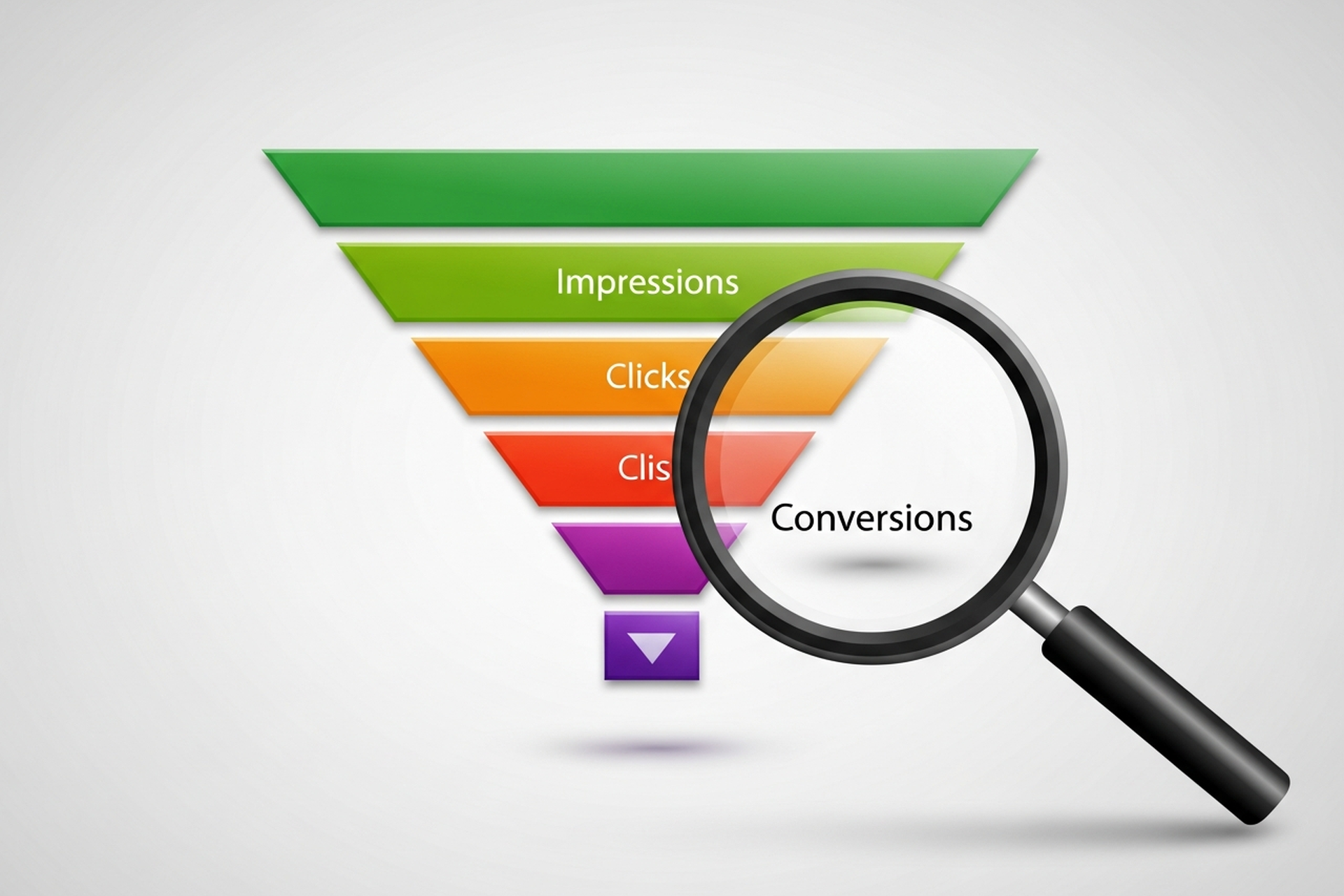
A CRO agency studies why visitors leave without converting and then runs structured experiments to fix those friction points. The work spans research, design, development, and statistical analysis, which is why most in-house teams struggle to run it properly alongside their other responsibilities.
Every credible CRO engagement follows a similar arc. The agency starts with a deep diagnostic phase: reviewing analytics data, auditing goal tracking, mapping your funnel, and identifying where the largest drop-offs occur. That quantitative analysis is paired with qualitative research (heatmaps, click maps, scroll-depth analysis, session recordings, and user surveys) to understand the why behind the numbers.
From there, the agency builds a prioritized hypothesis backlog. Each hypothesis is a testable idea: "If we move the CTA above the fold on the product page, we expect checkout starts to increase by X%." Testing is where the agency earns its fees. Well-run A/B and multivariate tests separate signal from noise and produce wins you can compound over time.
The specific services offered vary by agency, but most full-service conversion optimization agencies cover:
Boutique shops typically focus on A/B testing and landing pages. Full-service CRO teams include UX researchers, data analysts, copywriters, designers, and developers working together on every conversion touchpoint. Understanding which model fits your needs is part of the evaluation process.
The CRO industry has no formal certification that guarantees quality, so evaluation comes down to evidence. Here's what separates strong agencies from ones that will run a few tests and report inconclusive results.
Ask how they build and prioritize a hypothesis backlog. A serious agency uses frameworks like PIE scoring (Potential, Importance, Ease) or ICE scoring to prioritize experiments by potential impact and implementation cost. If they can't articulate a structured methodology, expect ad hoc testing that wastes months.
Running a test and calling a winner is not CRO. The results need statistical significance before you can trust them, and a good agency will explain their significance thresholds and minimum sample size requirements before a test begins. Agencies that declare winners after two days of data are giving you noise, not insight.
Ask for case studies with before-and-after conversion rates, traffic volumes, and test durations. Generic claims like "we improved conversions by 47%" mean little without context. Specifics matter: which page, what was the change, how long did the test run, and how large was the sample?
A proper CRO engagement starts with confirming your analytics are trustworthy. If an agency skips the tracking audit, they're building experiments on bad data. This matters significantly for DTC and ecommerce brands where small measurement errors can mislead an entire testing program. Our guide on ecommerce analytics covers what a clean measurement foundation looks like.
You should receive regular reports that connect test outcomes to business metrics, not just conversion rate changes. A good agency explains what a win means for revenue, not just which variant performed better.
CRO agency pricing varies considerably based on scope, traffic volume, and the seniority of the team you're accessing. Rough ranges for 2026:
| Agency Tier | Monthly Retainer |
|---|---|
| Entry-level / newer teams | $2,000 - $5,000 |
| Mid-tier with solid track record | $5,000 - $8,000 |
| Senior full-service agencies | $10,000 - $35,000+ |
Most engagements run on a monthly retainer model with a minimum 6-month commitment. That minimum exists for a reason: CRO requires time to build a hypothesis backlog, run tests to statistical significance, and implement wins. Agencies that offer month-to-month engagements with no minimum are often running too few tests to generate meaningful results.
Some agencies offer hybrid models that combine a lower base retainer with a performance component tied to conversion improvements. These reduce upfront risk but require agreed attribution methodology and clean baseline tracking before the engagement starts.
One-time audits are also available, typically ranging from $3,000 to $10,000, and can be a useful starting point if you want to understand your conversion gaps before committing to a full retainer.
Benchmarks help calibrate expectations. The global average website conversion rate sits around 3.68%, while top-performing sites achieve 11% or higher. For ecommerce, average rates vary significantly by vertical and traffic source.
What a well-run CRO program should produce:
These numbers assume your analytics are clean, your traffic volume supports statistical significance, and the agency is running tests with proper rigor. Lower traffic sites require longer test durations and may see slower progress.
Understanding how your marketing analytics tools feed into the testing process makes a material difference in how quickly you can generate reliable results.
CRO agencies aren't right for every stage. Here are the clearest signals that hiring makes sense:
Traffic exists but conversions have plateaued. If you're generating meaningful traffic but revenue isn't scaling proportionally, the problem is almost certainly in what happens after the click. More ad spend compounds the problem rather than solving it.
Your ROAS is declining and you've already optimized your ads. Once campaigns are dialed in, the next lever is on-site performance. Paid traffic that doesn't convert is just an expensive way to build session data. Our broader overview of conversion optimization maps out the full system.
You're investing in paid acquisition at scale. The larger your ad budget, the more a 1-2% conversion rate improvement is worth. At $100,000 per month in paid spend, doubling your conversion rate has the same effect on revenue as doubling your budget.
You have enough traffic to run valid tests. A/B tests require meaningful sample sizes to reach statistical significance. As a general rule, you need at least 1,000 monthly conversions per page to run tests that produce reliable results in a reasonable timeframe. Smaller sites can still benefit from CRO audits and qualitative research, but the testing cadence will be slower.
You've exhausted what your in-house team can execute. CRO requires skills across analytics, UX, design, copywriting, and development. Most in-house teams are strong in one or two areas. Agencies bring the full stack.
A conversion rate optimisation agency has a narrower focus than a full-service growth marketing partner. CRO agencies specialize in on-site behavior and experiment design. Growth marketing spans acquisition, retention, and the full customer lifecycle.
For many brands, the right answer is both: a growth agency managing acquisition channels while CRO work runs in parallel, maximizing the value of every visitor driven by paid and organic efforts. For brands at earlier stages, growth consulting often makes more sense as a starting point before isolating CRO as a dedicated workstream. Understanding how your analytics stack connects those two disciplines helps ensure the insights from one feed directly into the other.
The best CRO agency for your business is the one that matches your traffic volume, funnel complexity, and internal bandwidth. A boutique shop focused on ecommerce A/B testing is a poor fit for a B2B SaaS company with a multi-touch sales cycle. A full-service enterprise team is overkill for a DTC brand with $50K in monthly revenue.
Before any sales call, clarify: their experience with your business model, their testing methodology, minimum sample size requirements, reporting cadence, and what happens when a test is inconclusive. The answers will tell you more than any case study deck.
If you're evaluating whether CRO fits your current growth phase or want to understand what a data-driven optimization program looks like in practice, EmberTribe works with DTC and growth-stage brands to build and execute programs that compound over time.
If you're spending money on paid media or investing in content to drive organic traffic, conversion rate optimisation is the discipline that determines whether that traffic actually turns into revenue. Done well, CRO compounds your existing acquisition investment — you get more customers from the same traffic, without needing proportionally more spend.
Conversion rate optimisation (note the British spelling — this is how the keyword is commonly searched, and how teams across the UK, Australia, and much of Europe refer to the practice) is one of the highest-ROI investments a growth-stage brand can make. Yet it's often deprioritised in favour of acquisition channels that are more immediately visible.
This guide explains what conversion rate optimisation actually is, how it works in practice, which tools matter, and how to build a CRO programme that generates compounding returns.
Conversion rate optimisation is the systematic process of increasing the percentage of website visitors who complete a desired action — a purchase, a sign-up, a demo request, a form submission.
The conversion rate itself is simple to calculate:
Conversion Rate = (Conversions ÷ Total Visitors) × 100
If your store receives 10,000 visitors per month and 200 of them purchase, your conversion rate is 2%. CRO is the discipline of understanding why the other 9,800 didn't convert — and systematically fixing it.
What CRO is not is a collection of random button-colour tweaks. Real conversion rate optimisation is a research-driven, hypothesis-led methodology that produces learning as well as results. Even a test that doesn't improve conversion rate is valuable if it teaches you something about why visitors behave the way they do.
The economics of CRO are compelling compared to acquisition-focused alternatives.
Doubling your traffic through paid media doubles your ad spend. Doubling your conversion rate doubles your revenue from the same traffic. In practice, getting from a 1.5% to a 3.0% conversion rate is faster and cheaper than doubling your qualified traffic — and the improvement is permanent rather than dependent on ongoing spend.
Consider a store with 20,000 monthly visitors, a 1.5% conversion rate, and a £60 AOV:
A one percentage point improvement in conversion rate produces £12,000 in additional monthly revenue without a single additional pound of ad spend. That's the return profile that makes CRO so powerful for growth-stage ecommerce and DTC brands.
The best conversion rate optimisation teams operate as a structured research function, not a testing team. The process looks like this:
Before you test anything, you need to understand where and why visitors are dropping off. This means:
This research phase is where most CRO programmes stumble. Teams jump to testing without first understanding the actual problem — and end up testing solutions to problems that don't exist.
A good CRO hypothesis follows a specific structure:
"We believe that [specific change] will [expected outcome] because [evidence or reasoning]. We'll know it worked if [measurable metric] improves."
For example: "We believe that adding a 30-day returns guarantee to the product page hero will increase add-to-cart rate because customer interviews show purchase hesitation is primarily driven by returns uncertainty. We'll know it worked if add-to-cart rate improves by 10%+."
This structure keeps experiments focused and ensures that every test — whether it wins or loses — produces actionable learning.
The most common CRO test format is A/B testing — showing one version of a page to 50% of visitors and a variant to the other 50%, then measuring which version produces a higher conversion rate.
For more complex changes involving multiple elements, multivariate testing allows you to test combinations simultaneously — but requires significantly more traffic to reach statistical significance.
A common mistake is running tests for too short a period. Traffic and conversion patterns vary by day of week, time of month, and seasonal factors. Most tests need a minimum of two full business cycles (typically two to four weeks) before results are reliable.
When a test concludes, the analysis should go beyond "did it win or lose?" Ask:
A test that loses overall may reveal that a specific user segment (mobile users, returning visitors, users from organic search) responded positively — leading to a more targeted follow-up test.
Winning tests should be implemented permanently and documented clearly. Every CRO programme should maintain a library of test results that new experiments can reference — so the programme builds on its own learning over time rather than starting from scratch with each test cycle.
Not all pages and elements are equal. The areas that typically yield the greatest conversion rate improvement:
Product pages: Hero imagery, trust signals (reviews, guarantees, security badges), product descriptions focused on outcomes rather than features, variant selection clarity
Checkout flow: Form length, payment method options, shipping cost transparency, order summary clarity, guest checkout availability
Landing pages: Headline and value proposition alignment with traffic source, above-the-fold CTA clarity, page load speed on mobile
Cart and bag pages: Abandoned cart drivers (shipping cost shock is the most common), cross-sell placement, urgency signals
Site navigation and search: Can users find what they're looking for? Poor navigation is a conversion killer that's easy to overlook.
A complete CRO tech stack typically requires four categories of tools:
Google Analytics 4 — free, covers traffic, funnel events, and conversion tracking. Essential baseline for any CRO programme.
Hotjar or Microsoft Clarity (free) — heatmaps, session recordings, and on-site surveys. These tools show you how users interact with pages, which quantitative analytics alone can't reveal.
VWO (Visual Website Optimizer) — a full-stack testing platform that covers A/B testing, multivariate tests, split URL tests, and personalisation. One of the most widely used CRO platforms across ecommerce and SaaS. Other options include Optimizely (enterprise) and AB Tasty.
On-site survey tools (Hotjar, Typeform, or Medallia) that capture exit intent and post-purchase feedback. The qualitative data from surveys often generates the most actionable hypotheses.
Testing too many changes at once: If you change the headline, the hero image, the CTA colour, and the product description simultaneously, you won't know which change drove the result.
Stopping tests too early: A test that appears to be winning in week one often converges toward parity by week three. Statistical significance requires patience.
Ignoring mobile: In most ecommerce categories, mobile accounts for 60–70%+ of traffic. A page that converts well on desktop but fails on mobile is still failing.
Treating all traffic equally: A visitor arriving from a branded search query has very different intent than one arriving from a generic informational post. Conversion rate benchmarks should be segmented by traffic source, not just measured as a site-wide average.
Skipping the research phase: Running tests without first understanding why users aren't converting is like writing solutions before diagnosing the problem. The research phase isn't optional — it's what makes your tests likely to succeed.
Individual test wins are valuable. A systematic CRO programme is transformative. The difference is whether your testing generates accumulated learning — a growing body of insight about your specific customers, their objections, their decision triggers, and what makes them trust your brand.
At EmberTribe, conversion rate optimisation sits at the centre of how we approach growth for ecommerce and DTC clients — because improving conversion makes every other channel more efficient. A higher CVR means paid media generates more revenue from the same spend, organic traffic converts into customers at a higher rate, and email flows close more of the customers who were already considering.
The goal isn't a single winning test. It's a programme that makes your business structurally more profitable over time.
For more on applying CRO principles in practice, see our guide to ecommerce conversion rate optimisation tactics and our breakdown of the ecommerce analytics metrics that drive decisions.
If you've spent any time reading about conversion optimization, you've probably seen the same recycled advice: test your button color, add urgency to your headline, tweak your hero image. That kind of content treats CRO like a bag of tricks. It isn't. Done well, conversion optimization is the most reliable way growth-stage brands turn existing traffic into more revenue without raising their ad budget by a dollar.
The problem is that most teams approach it as a series of one-off tests rather than a system. They run an experiment, see a flat result, lose interest, and move on. Six months later their conversion rate is the same and they blame "CRO doesn't work for us" instead of the approach. The brands that compound wins year after year do something different, and it has nothing to do with picking better button colors.
This guide walks through what conversion optimization actually means in 2026, where the highest-ROI work lives, the common mistakes that quietly kill programs, and how to know whether your team should run CRO in-house or bring in outside help.
At the surface level, the definition is simple. Conversion optimization is the practice of increasing the percentage of visitors who take a desired action on your site, whether that's a purchase, a free trial signup, a demo booking, or an email capture. The math is a basic ratio: conversions divided by sessions.
What makes it meaningful as a discipline is the method, not the math. Real CRO is a continuous, evidence-based process that combines analytics, user research, hypothesis-driven experimentation, and statistical rigor. Nielsen Norman Group has been writing about conversion rate work for two decades, and the throughline is consistent: the teams that improve sustainably are the ones treating CRO as user experience research, not as marketing "hacks."
The distinction matters because the two approaches produce very different outcomes. Tactic-chasing programs hit a ceiling around month three. Systematic programs get better over time because each experiment adds to your understanding of who your users are and how they behave, which makes the next hypothesis sharper than the last.
The easiest way to picture a functional CRO program is as a loop with four stages that feed each other.
Research: Before you touch a page, you need to know where users actually struggle. This comes from analytics drop-off data, session recordings from tools like Hotjar, heatmaps, customer support logs, on-site polls, and qualitative interviews. The goal at this stage is not to invent ideas. It is to collect evidence.
Hypothesis: A hypothesis takes the form "because we observed X, we believe that Y will improve the outcome by Z, and we'll know because of these metrics." A hypothesis without observed evidence is a guess. A guess without a measurable metric is a vibe.
Experiment: This is where most teams start, and that's the mistake. A well-designed experiment follows from research and hypothesis, runs long enough to reach statistical power, and measures the specific metric the hypothesis predicted, not whatever looks favorable after the fact.
Learn: Every result, win, loss, or flat, is information that sharpens the next iteration. Losses are often more valuable than wins because they correct flawed models of user behavior. Programs that only document winners lose half the learning.
When these stages are connected, the loop compounds. When any one stage is skipped, the program becomes a random-ideas factory and the conversion rate stays flat.
Not every page or funnel step is worth optimizing first. The sequencing below reflects what we see move the needle fastest for most DTC and growth-stage SaaS clients.
Checkout is where intent meets friction, which makes it the highest-impact surface in the entire funnel. Research from Baymard Institute shows the average large ecommerce site can gain up to a 35% increase in conversion rate through checkout design changes alone, and that 64% of desktop checkouts tested by their team rate "mediocre" or worse. Common wins live in the obvious places: guest checkout as the default path, forgiving password requirements, explicit delivery dates instead of vague shipping speeds, and error messages that tell users exactly what's wrong.
For SaaS, the equivalent is the signup and onboarding path. Friction between "I want to try this" and "I'm inside the product" costs more than any landing page headline ever will.
Product pages and paid-media landing pages are the second-highest leverage surfaces. This is where the customer decides whether the offer is credible, relevant, and worth the money. Clear value propositions, trust signals placed near the buying decision, well-organized social proof, and page speed under 2.5 seconds all tend to show up in winning tests.
Homepage and category-level optimization matters, but it matters less than most brands think. Fixing a leaky cart has a bigger compounding effect than redesigning a hero section. Work down the funnel first, then back up.
Most CRO programs don't fail because the team picked bad tests. They fail because the testing discipline underneath was broken in ways nobody caught.
Running underpowered tests. The experts at CXL have written extensively about this: most ecommerce sites simply don't have enough traffic to detect realistic lifts in a reasonable timeframe. If your "winner" only needed 400 visitors per variant to show significance, it wasn't actually a winner. It was noise.
Peeking at results and stopping early. Checking a test every day and calling it as soon as you see significance inflates your false positive rate dramatically. A test that looks like a 20% winner on day three can flatten to zero by day fourteen. Set your sample size up front, and leave the test alone until it hits the threshold. A good primer on statistical significance in A/B testing explains why that discipline matters mathematically.
Confusing statistical significance with business significance. A test can be statistically significant and practically useless. A 0.3% lift on a microconversion doesn't justify the engineering cost to implement it. Always check whether the effect size is large enough to matter to the business.
Testing tiny changes with no theory. Button colors, headline tweaks, and generic copy shuffles rarely produce meaningful lifts because the underlying user behavior isn't changing. Bigger, research-grounded hypotheses win more often. GoodUI has catalogued hundreds of evidence-based patterns from real tests, and the throughline is clear: bold changes rooted in behavioral research beat timid tweaks.
Claiming 200% lifts. If you see a case study claiming a 200% conversion lift, read it skeptically. Either the starting baseline was tiny, the test was underpowered, or the definition of "conversion" got stretched. Realistic wins on a mature program usually land between 3% and 15% per experiment. Those add up over a year. The clickbait "200% lift" usually doesn't hold up in a follow-up test.
Conversion rate as a single number hides more than it reveals. Segment it or you'll draw the wrong conclusions.
Segment by traffic source. Paid social, paid search, organic, email, and direct all behave differently. A test that looks flat in aggregate often has a clear winner inside one segment. Aggregate conversion rate is a vanity metric when you're trying to diagnose a problem.
Segment by device. Mobile and desktop users convert differently, sometimes dramatically. A design that works beautifully on desktop can tank on mobile. Run tests device-split from the start.
Segment by new versus returning. New users and returning users are solving different problems. A checkout tweak that helps one often hurts the other.
Track revenue per visitor, not just conversion rate. A test that raises conversion rate but lowers average order value can leave you worse off on the only metric that pays salaries. Revenue per visitor is the honest scoreboard.
Use cohorts for longer-term measurement. Some CRO wins show up in week-one conversion. Others show up in 30-day or 90-day repeat behavior. Cohort analysis catches the wins that simple aggregate reports miss.
CRO is one of the easier disciplines to start in-house and one of the harder ones to scale. Here's a rough framework for when to bring in outside help.
You can probably do it yourself if: your site gets enough traffic to run credible tests (roughly 25,000+ sessions per month per variant), someone on the team understands basic statistics, and the roadmap is research-driven rather than opinion-driven.
You probably need help if: you're trying to connect CRO to paid media strategy, your traffic is too thin for traditional A/B testing and you need a different experimentation model, or your team keeps running tests that come back flat and nobody can figure out why. At that point you're usually missing either the research muscle, the statistical discipline, or the integration with acquisition.
The mistake we see most often with brands hiring agencies is expecting month-one wins. Good CRO work in the first 90 days is mostly research, hypothesis development, and instrumentation. Tests that actually move revenue usually start landing in months three through six. Any partner promising big wins in month one should be treated with the same suspicion as any partner promising guaranteed rankings.
Conversion optimization rewards the teams willing to treat it as a discipline. The same traffic you're already paying for can produce meaningfully more revenue if the system underneath is working. The gap between mediocre and good CRO isn't access to fancy tools. It's the research, the statistical honesty, and the patience to let tests run their full course.
If you're running paid media, your CRO work and your acquisition work should be connected. The messaging on your landing pages should match the messaging in your ads, and the segments you're bidding on should be the segments you're testing for. Running them as separate workstreams is one of the most common and expensive mistakes brands make, and we covered it in depth in our ecommerce CRO guide for growth-stage DTC brands.
If your model is SaaS, the same logic applies across the B2B SaaS lead generation funnel, where message match between ad, landing page, and signup flow often decides whether a campaign returns anything at all.
If your conversion rate has been stuck and you want an honest read on where the real leverage is, that's the work we do every day at EmberTribe. Our team integrates CRO with paid media strategy so the experiments you run actually connect to the traffic you're buying, and so wins compound instead of evaporating between disconnected teams. You can see how that integrated approach fits into a larger ecommerce growth strategy that treats acquisition, conversion, and retention as one system.
The brands that pull ahead in 2026 won't be the ones chasing the latest "hack." They'll be the ones running disciplined programs, asking sharper questions, and letting real evidence drive the roadmap. That's a harder path than copying a template, but it's the only one that compounds. If you'd like to talk through what that could look like for your business, we're always glad to take the call.

A landing page has one job: convert a visitor into a lead or customer. Unlike a homepage, which serves multiple audiences and objectives, a landing page exists to drive a single action. That simplicity is its strength, but only when the page is built with deliberate, tested best practices.
Whether you are running paid ads, email campaigns, or organic content that funnels traffic to a dedicated page, the principles below will help you capture more conversions without increasing your traffic budget.
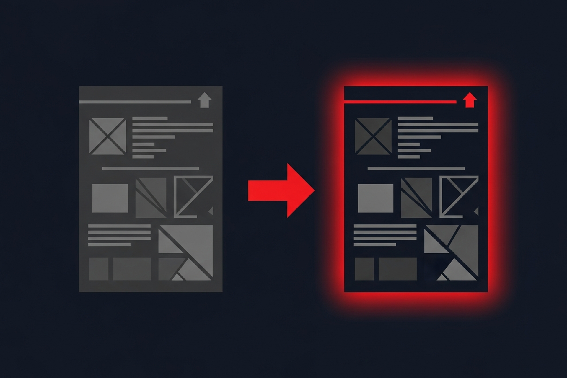
The number one reason landing pages underperform is message mismatch. When a visitor clicks an ad promising "50% Off Running Shoes," the landing page headline must reinforce that exact promise. If the visitor lands on a generic page with a headline about your brand story, they bounce.
A strong headline-to-ad match can improve your conversion rate by 30 percent or more simply by reducing cognitive friction.
Landing pages fail when they ask the visitor to do too many things. Every additional link, navigation item, or secondary CTA dilutes attention and reduces the probability that the visitor completes the primary action.
Visitors do not care about your product's technical specifications until they understand what those specifications do for them. Lead with the transformation or outcome, then support it with feature details.
Trust is the invisible barrier between a visitor and a conversion. Social proof, including customer testimonials, brand logos, review scores, and case study results, reduces perceived risk and validates the purchase decision.
Social proof is especially important for brands running cold traffic campaigns where the visitor has no prior relationship with your company. The principles of conversion rate optimization all point back to reducing friction, and social proof is one of the most effective friction reducers available.
Every additional second of load time costs conversions. Research consistently shows that pages loading in under two seconds convert at significantly higher rates than slower pages. For mobile traffic, which now accounts for the majority of clicks on most paid campaigns, speed is even more critical.
If more than half of your landing page traffic comes from mobile devices, and for most paid social campaigns it does, your page must be designed mobile-first rather than adapted from a desktop layout after the fact.
A well-designed landing page guides the visitor's eye from headline to supporting content to CTA in a natural, effortless flow. Poor visual hierarchy forces the visitor to work to understand what the page offers, and most will not bother.
Every form field is a micro-decision that requires effort from the visitor. The more effort required, the fewer completions you will see. The goal is to collect only the information you need to take the next step in the relationship.
Form optimization is a critical part of optimizing your sales funnel from top to bottom. Small reductions in form friction compound into significant conversion lifts over time.
No amount of best-practice advice replaces empirical testing on your specific audience. What works for a SaaS product may not work for a DTC supplement brand. The only way to know what converts is to test.
The conversion is not the finish line. What happens immediately after the visitor submits the form or clicks "Buy" shapes their perception of your brand and determines whether they become a repeat customer or a one-time transaction.
A strong post-conversion experience reduces buyer's remorse, increases lifetime value, and turns customers into advocates. It is also a factor that most competitors neglect, which makes it an easy differentiation point.
Landing page optimization is not a one-time project. It is an ongoing discipline of testing, measuring, and refining. The brands that treat landing pages as living assets, rather than static pages set and forgotten, consistently outperform competitors who spend more on traffic but neglect the conversion experience.
Start with the practices above, prioritize the areas where your current pages fall shortest, and build a cadence of continuous improvement. More traffic is expensive. Better conversion rates are earned through craft and attention to detail.
If you think about what makes modern marketing so powerful, all roads lead to one thing: personalization.
Facebook ads are powerful because of how precisely we can target an audience. Search ads are powerful because we can target the intent of a potential customer based on what they're searching for in Google.
This high degree of personalization turns advertisers into snipers who find the right people at the right time with the right offer.

Let's get started.
Big picture
We're going to:
You don't have to be a technical whiz. Just follow the directions and you'll do great.
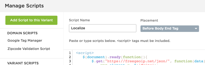
We wrote a script that calls on a free service, Snoopi.io. Snoopi.io detects the visitor's IP address, then looks it up in a database to find the city and state names. It also can find things like latitude and longitude, ISP provider, if the user is using a mobile device; which is cool if you wanted to geek out and show a map with a user's current location or get additional information to help with marketing efforts.
The script we wrote acts as a bridge between this service and your landing page, so you can store and use that information in your landing page's content.
NOTE: To use this lookup service, you'll need to create a free account and get an API key which allows 10k free requests per month. API key is not required for testing purposes.
We're using Unbounce for this particular tutorial, but any platform will do just fine, provided you have the ability to add Javascript to your pages.
Now that you downloaded the script in the step above, add it to your landing page.
So remember, we called up Snoopi.io to retrieve the city name, we grabbed that information with the script, now we need to tell the script where to put it on your page.
Typically, we'd recommend adding a user's location somewhere in the headline of your page so that it stands out. But you can also get creative, and work it into other places like your CTA button text. The key here is to make it as natural as possible, so the user feels like you created this lander just for them.
In any case, we're going to use a tag to identify where the script should insert the city name.
Name the span id "location".
Let's clarify what's happening here. You're adding this element right within the HTML of a headline. Think of that entire span tag as the city name. In the example above, you can see that we added a contrasting color for it to pop.
The script is looking for the id "location" if you've followed these instructions. But if you want to add the city to some other element, you just have to change the "id" in the script to look for that element.
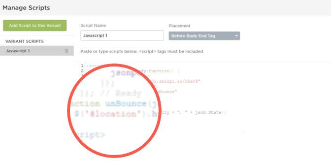
If the IP lookup service can't find a city name in their database, our script will fall back on a state name. So keep that in mind when using the script to avoid any awkward phrasing.
Here is an overview video to help with implementation...
Just because you can do something doesn't mean you should. Is your offer dependent on location? Then it might make sense to add it dynamically to your landing page. Think: events, job openings, dating, etc.
🤔 Can I optimize my landing page too much? Turns out, yes. →
If a user's location has no bearing on the offer, don't force it. We've seen instances where using this tactic can actually lower conversion rates if it's out of place.
Don't forget that once you're able to capture location, that's where the fun begins. Adding a city name as text to your copy is only one simple application, but the possibilities are endless: pre-populating form fields, customizing a checkout experience, etc.
Now go forth and personalize!