
Most marketing teams have access to more data than ever, yet still struggle to answer a simple question: is our spend working? The problem is not a lack of data. It is a lack of one coherent analytics dashboard that surfaces the right numbers at the right time.
A well-built marketing analytics dashboard eliminates the context-switching between ad platforms, CRM reports, and spreadsheets. It gives your team a single source of truth, enabling faster decisions and tighter feedback loops between creative, media, and revenue.
A marketing analytics dashboard is a centralized, interactive interface that pulls data from multiple sources and displays key performance indicators in one view. The best implementations update in real time or near-real time, automatically refreshing as campaigns run and orders come in.
Unlike static reports, a live dashboard lets you react. You can spot a ROAS drop on a Tuesday morning and adjust bids before the day burns through budget. That speed-to-insight gap is where growth compounds or erodes.
According to Improvado's 2026 dashboard research, the average marketing team now manages data from more than a dozen platforms. Without a dashboard aggregating that data, teams default to manual exports and lose hours every week to reconciliation work.
The metrics you include depend on your funnel stage and business model, but these are the non-negotiables for DTC and growth-stage brands.
For a deeper breakdown of how these metrics fit into a full measurement stack, see our guide to marketing analytics services.
Choosing the right tool depends on your team size, technical resources, and data sources. Here is how the leading platforms compare.
Looker Studio is free and integrates natively with Google Analytics 4, Google Ads, Search Console, BigQuery, and YouTube Analytics. For teams whose data lives primarily in the Google ecosystem, it is hard to beat on cost-to-value. The trade-off is that building complex cross-channel views requires more configuration and some familiarity with data blending.
Looker Studio works best as a reporting layer when your underlying data is already clean and consolidated. If you are pulling from six ad platforms, you will likely need a connector or a warehouse in between.
Databox is purpose-built for marketing KPI monitoring. It connects to Shopify, Google Ads, Meta Ads, HubSpot, and email platforms in minutes, with pre-built templates that get you to a working dashboard quickly. The mobile app is strong, and goal-tracking features make it easy to align team performance against targets.
Pricing starts at $169/month for professional tiers. The tradeoff versus Looker Studio is cost, though the time saved on setup and maintenance often justifies it for lean teams. Per Graphed's comparison, Databox wins on speed and goal tracking while Looker Studio wins on customization.
Power BI is the enterprise-grade option with the deepest Microsoft ecosystem integration. At $14 to $25 per user per month, it offers a massive library of interactive visualizations, AI-powered anomaly detection, and robust data governance. For brands running significant spend on Microsoft Advertising or already invested in Azure, it is a natural fit.
Power BI's visualization engine is more powerful than Looker Studio's out of the box, but it requires more technical setup and a steeper learning curve for non-technical stakeholders.
For Shopify brands running heavy paid social, Triple Whale has become the default analytics dashboard. It handles first-party pixel tracking, attribution modeling, and creative analytics in one place. The Summary page gives founders and media buyers a daily snapshot of blended ROAS, new customers, and contribution margin without any manual work.
If your entire stack is Shopify plus Meta plus TikTok, Triple Whale's purpose-built metrics (MER, nCAC, Blended ROAS) reduce the cognitive load of working across generic BI tools.
For a broader comparison of platforms at different price points, our analytics platforms guide covers how these tools fit into a full martech stack.
Having the tools is only half the equation. The architecture matters just as much.
Start by mapping every touchpoint that influences revenue: paid channels, organic search, email, SMS, and your ecommerce platform. Each source needs a reliable, automated connection to your dashboard. Manual CSV imports are a liability; one missed export skews every downstream metric.
Your web analytics tool is the anchor. Every campaign should pass UTM parameters consistently so sessions, conversions, and revenue can be attributed correctly before they surface in your dashboard.
A CEO wants blended ROAS, revenue, and new customer count. A media buyer wants campaign-level CPA and impression share. A retention manager wants repeat rate and LTV cohorts. Building one monolithic dashboard that serves all three usually serves none of them well.
Create views for each role. Most tools support this natively through page-based dashboards or user-level permissions. The goal is to reduce the cognitive load for each viewer so they can act immediately on what they see.
Raw numbers without context are incomplete. Set target ranges for your key metrics and configure alerts that fire when performance moves outside acceptable bounds. A 20% drop in conversion rate overnight is a different signal than a gradual 5% decline over two weeks, and your dashboard should make that distinction obvious.
AgencyAnalytics' 2026 benchmark data shows that teams using alert-based dashboards respond to anomalies an average of 4 hours faster than teams relying on scheduled reports. For campaigns running $10,000 per day, that response time difference is material.
Real-time dashboards are valuable, but they are only as reliable as the underlying data pipelines. Google Ads data can lag by 3 to 4 hours. Meta data can lag longer. Understand the refresh cadence for each data source and label it in your dashboard so viewers do not mistake stale data for current performance.
For SEO and organic data, a daily or weekly refresh is typically sufficient. Pair this with your SEO web analytics reporting to track organic performance alongside paid in a unified view.
Tracking too many metrics. A dashboard with 40 KPIs is not more informative than one with 12. Each additional metric dilutes attention. Start with the metrics that directly answer "should we spend more, less, or differently?"
Ignoring attribution methodology. Last-click attribution overstates the value of bottom-funnel channels and understates the contribution of prospecting campaigns. Understand the attribution model your dashboard uses before drawing conclusions about channel performance.
No single owner. Dashboards decay without ownership. Assign one person to review the data quality, update connections when APIs change, and flag when metrics deviate from expectations. Without this, dashboards become untrustworthy and teams revert to gut feel.
Mixing marketing metrics with finance metrics without context. Revenue on your analytics dashboard is marketing revenue. It may not match your finance team's recognized revenue due to returns, chargebacks, and timing differences. Label this clearly to avoid confusion in cross-functional reviews.
Early-stage brands with limited budgets should start with Looker Studio plus GA4. It is free, well-documented, and sufficient for tracking the core acquisition and conversion metrics that matter most before hitting seven figures.
Scaling brands running $50,000 or more per month in ad spend should evaluate Databox, Triple Whale, or a custom Looker Studio setup backed by a data warehouse. At this stage, the cost of bad data or slow reporting exceeds the cost of better tooling.
Enterprise teams with complex attribution needs and large analyst teams benefit most from Power BI or Tableau, where data governance, custom modeling, and multi-team access are non-negotiable.
The right analytics dashboard is the one your team actually uses. Choose a tool that matches your technical capacity, connects reliably to your data sources, and makes the right metrics immediately visible to the people making daily decisions.
Want help building a measurement framework that connects your analytics dashboard to actual revenue outcomes? Our marketing analytics services are built for growth-stage brands that need clarity, not more complexity.


Most marketing teams have access to more data than ever, yet still struggle to answer a simple question: is our spend working? The problem is not a lack of data. It is a lack of one coherent analytics dashboard that surfaces the right numbers at the right time.
A well-built marketing analytics dashboard eliminates the context-switching between ad platforms, CRM reports, and spreadsheets. It gives your team a single source of truth, enabling faster decisions and tighter feedback loops between creative, media, and revenue.
A marketing analytics dashboard is a centralized, interactive interface that pulls data from multiple sources and displays key performance indicators in one view. The best implementations update in real time or near-real time, automatically refreshing as campaigns run and orders come in.
Unlike static reports, a live dashboard lets you react. You can spot a ROAS drop on a Tuesday morning and adjust bids before the day burns through budget. That speed-to-insight gap is where growth compounds or erodes.
According to Improvado's 2026 dashboard research, the average marketing team now manages data from more than a dozen platforms. Without a dashboard aggregating that data, teams default to manual exports and lose hours every week to reconciliation work.
The metrics you include depend on your funnel stage and business model, but these are the non-negotiables for DTC and growth-stage brands.
For a deeper breakdown of how these metrics fit into a full measurement stack, see our guide to marketing analytics services.
Choosing the right tool depends on your team size, technical resources, and data sources. Here is how the leading platforms compare.
Looker Studio is free and integrates natively with Google Analytics 4, Google Ads, Search Console, BigQuery, and YouTube Analytics. For teams whose data lives primarily in the Google ecosystem, it is hard to beat on cost-to-value. The trade-off is that building complex cross-channel views requires more configuration and some familiarity with data blending.
Looker Studio works best as a reporting layer when your underlying data is already clean and consolidated. If you are pulling from six ad platforms, you will likely need a connector or a warehouse in between.
Databox is purpose-built for marketing KPI monitoring. It connects to Shopify, Google Ads, Meta Ads, HubSpot, and email platforms in minutes, with pre-built templates that get you to a working dashboard quickly. The mobile app is strong, and goal-tracking features make it easy to align team performance against targets.
Pricing starts at $169/month for professional tiers. The tradeoff versus Looker Studio is cost, though the time saved on setup and maintenance often justifies it for lean teams. Per Graphed's comparison, Databox wins on speed and goal tracking while Looker Studio wins on customization.
Power BI is the enterprise-grade option with the deepest Microsoft ecosystem integration. At $14 to $25 per user per month, it offers a massive library of interactive visualizations, AI-powered anomaly detection, and robust data governance. For brands running significant spend on Microsoft Advertising or already invested in Azure, it is a natural fit.
Power BI's visualization engine is more powerful than Looker Studio's out of the box, but it requires more technical setup and a steeper learning curve for non-technical stakeholders.
For Shopify brands running heavy paid social, Triple Whale has become the default analytics dashboard. It handles first-party pixel tracking, attribution modeling, and creative analytics in one place. The Summary page gives founders and media buyers a daily snapshot of blended ROAS, new customers, and contribution margin without any manual work.
If your entire stack is Shopify plus Meta plus TikTok, Triple Whale's purpose-built metrics (MER, nCAC, Blended ROAS) reduce the cognitive load of working across generic BI tools.
For a broader comparison of platforms at different price points, our analytics platforms guide covers how these tools fit into a full martech stack.
Having the tools is only half the equation. The architecture matters just as much.
Start by mapping every touchpoint that influences revenue: paid channels, organic search, email, SMS, and your ecommerce platform. Each source needs a reliable, automated connection to your dashboard. Manual CSV imports are a liability; one missed export skews every downstream metric.
Your web analytics tool is the anchor. Every campaign should pass UTM parameters consistently so sessions, conversions, and revenue can be attributed correctly before they surface in your dashboard.
A CEO wants blended ROAS, revenue, and new customer count. A media buyer wants campaign-level CPA and impression share. A retention manager wants repeat rate and LTV cohorts. Building one monolithic dashboard that serves all three usually serves none of them well.
Create views for each role. Most tools support this natively through page-based dashboards or user-level permissions. The goal is to reduce the cognitive load for each viewer so they can act immediately on what they see.
Raw numbers without context are incomplete. Set target ranges for your key metrics and configure alerts that fire when performance moves outside acceptable bounds. A 20% drop in conversion rate overnight is a different signal than a gradual 5% decline over two weeks, and your dashboard should make that distinction obvious.
AgencyAnalytics' 2026 benchmark data shows that teams using alert-based dashboards respond to anomalies an average of 4 hours faster than teams relying on scheduled reports. For campaigns running $10,000 per day, that response time difference is material.
Real-time dashboards are valuable, but they are only as reliable as the underlying data pipelines. Google Ads data can lag by 3 to 4 hours. Meta data can lag longer. Understand the refresh cadence for each data source and label it in your dashboard so viewers do not mistake stale data for current performance.
For SEO and organic data, a daily or weekly refresh is typically sufficient. Pair this with your SEO web analytics reporting to track organic performance alongside paid in a unified view.
Tracking too many metrics. A dashboard with 40 KPIs is not more informative than one with 12. Each additional metric dilutes attention. Start with the metrics that directly answer "should we spend more, less, or differently?"
Ignoring attribution methodology. Last-click attribution overstates the value of bottom-funnel channels and understates the contribution of prospecting campaigns. Understand the attribution model your dashboard uses before drawing conclusions about channel performance.
No single owner. Dashboards decay without ownership. Assign one person to review the data quality, update connections when APIs change, and flag when metrics deviate from expectations. Without this, dashboards become untrustworthy and teams revert to gut feel.
Mixing marketing metrics with finance metrics without context. Revenue on your analytics dashboard is marketing revenue. It may not match your finance team's recognized revenue due to returns, chargebacks, and timing differences. Label this clearly to avoid confusion in cross-functional reviews.
Early-stage brands with limited budgets should start with Looker Studio plus GA4. It is free, well-documented, and sufficient for tracking the core acquisition and conversion metrics that matter most before hitting seven figures.
Scaling brands running $50,000 or more per month in ad spend should evaluate Databox, Triple Whale, or a custom Looker Studio setup backed by a data warehouse. At this stage, the cost of bad data or slow reporting exceeds the cost of better tooling.
Enterprise teams with complex attribution needs and large analyst teams benefit most from Power BI or Tableau, where data governance, custom modeling, and multi-team access are non-negotiable.
The right analytics dashboard is the one your team actually uses. Choose a tool that matches your technical capacity, connects reliably to your data sources, and makes the right metrics immediately visible to the people making daily decisions.
Want help building a measurement framework that connects your analytics dashboard to actual revenue outcomes? Our marketing analytics services are built for growth-stage brands that need clarity, not more complexity.

Most DTC brands already collect data. The problem is that the data lives in five different places, tells five different stories, and rarely points to a clear action. Customer analytics software is supposed to solve that, but choosing the wrong platform creates more noise, not less.
This guide breaks down what customer analytics software actually does, which platforms are worth evaluating, and how to match a tool to where your brand is right now.
Customer analytics software collects, processes, and surfaces behavioral data about the people who interact with your brand. At the core, it answers three questions: who your customers are, how they behave, and what drives them to buy (or stop buying).
The best platforms track behavior across the full customer journey: from the first ad click to product page engagement, cart behavior, checkout completion, post-purchase patterns, and eventual churn signals. This is different from standard web analytics, which stops at sessions and pageviews. Customer data analytics tools go deeper, connecting individual user identities to sequences of actions over time.
Key data types that flow through a modern customer analytics stack include event data (every click, scroll, and interaction), transaction data (order history, AOV, refunds), product data (which SKUs drive LTV), and user profile data from your CRM or CDP. The richness of that data determines how actionable your reporting actually becomes.
Before evaluating platforms, get clear on the metrics that matter most for growth-stage ecommerce brands.
LTV is the total revenue a single customer generates over the full duration of their relationship with your brand. It's the north-star metric for DTC because it determines how much you can afford to spend acquiring a customer in the first place. LTV by cohort, acquisition channel, and first-product purchased gives you the granular view needed to make smarter paid media decisions.
Customer acquisition cost (CAC) in isolation tells you nothing useful. Measured against LTV, it becomes the most important unit-economics number in your business. A ratio above 3:1 is healthy; below 1:1 means you're systematically losing money on each customer acquired. Most brands scaling on paid social are operating at ratios far lower than they realize.
Cohort analysis groups customers by when they first purchased and tracks how they behave over subsequent months. Ecommerce analytics research consistently shows that retention curves reveal the true health of a brand: if month-2 repurchase rates are weak across every acquisition cohort, no amount of new customer acquisition will fix the underlying problem.
Cart abandonment exceeds 70% across ecommerce broadly in 2026. The metric itself is table stakes; the useful version is abandonment segmented by traffic source, device, product category, and customer segment. That segmentation is where customer behavior analytics separates from basic funnel tracking.
Proactive churn analysis looks at behavioral signals before a customer formally "churns": increasing time between orders, declining email engagement, browsing without purchasing. Platforms with predictive capabilities can score customers by churn probability, letting retention teams intervene early rather than after the fact.
Choosing the right platform depends on your team's technical capacity, your primary use case, and your current scale. Here's how the main options stack up.

Amplitude has established itself as the enterprise-grade leader for behavioral analytics and product-led growth. Its core strength is behavioral cohorts that persist across analytics, experimentation, and user surveys. Predictive cohorts score users by likelihood to activate, retain, or churn, and native A/B testing is built directly into the platform.
Amplitude ranked first across multiple categories in G2's Winter 2026 report. It's best suited for growth teams running frequent experiments who need deep retention analytics backed by enterprise governance and support. Pricing is event-based and scales with volume; expect significant investment at the mid-market level.
Mixpanel prioritizes real-time granular event analysis and an intuitive interface that non-technical users can navigate without engineering support. Its AI query assistant lets marketing and growth teams pull custom reports without writing SQL. The free tier covers 20 million events per month, the most generous in its category.
Mixpanel is a strong choice for scaling brands that need detailed user journey mapping and fast feedback loops on product or funnel changes. At higher volumes, pricing moves to $650-1,200+/month. It integrates well with Segment as a data routing layer, which matters if you're building a composable analytics stack. Learning how to pair the right analytics platforms is often more valuable than chasing the most feature-rich single tool.
Heap takes a fundamentally different approach: instead of requiring manual event instrumentation, it captures every click, form submission, and page interaction automatically from day one. No tracking code decisions upfront. This is a significant advantage for brands without dedicated engineering resources.
The retroactive analysis capability is Heap's real differentiator: you can define events after the fact and run analysis on historical behavior that predates your instrumentation. Minimum pricing starts around $2,000/month, which means it makes more sense for brands with established revenue and a data team that can act on what it surfaces.
For Shopify-first DTC brands, Triple Whale has become the dominant analytics layer. Its AI suite (Moby) answers data questions in plain language, runs attribution analysis, and generates forecasts without requiring a BI setup. The platform focuses on profit-oriented reporting: contribution margin, blended CAC, and channel-level ROAS, the metrics DTC operators actually use to make daily decisions.
Triple Whale is less useful as a general customer behavior analytics tool and more useful as an operational dashboard for performance marketing teams. If you're running Shopify and spending meaningfully on paid social, it's likely the fastest path to actionable daily reporting.
Segment is not a visualization tool; it's a customer data platform that routes event data from your website, app, and backend to every downstream tool in your stack. Think of it as the plumbing that connects your customer analytics software together. Using Segment upstream of Mixpanel or Amplitude means you instrument once and can swap analytics tools without re-engineering your tracking layer.
For brands building a serious analytics stack, Segment or a similar CDP is worth the investment early. It also enables real-time personalization and audience building across your ad platforms and email tools.
The mistake most brands make is choosing a platform based on feature lists rather than their actual operational context. A few frameworks that cut through the noise:
Early-stage (under $5M revenue): Mixpanel's free tier plus Google Analytics 4 covers most reporting needs. Focus on getting clean event tracking in place rather than adding platform complexity. The highest-value analytics work at this stage is fixing attribution gaps and tracking the right conversion events.
Growth-stage ($5M-$50M revenue): This is where investing in a real customer behavior analytics layer pays off. Triple Whale is a natural fit for Shopify brands. Mixpanel or Amplitude makes sense if you're building a product-led motion or need cohort-level retention analysis. Adding Segment as a CDP backbone is worth evaluating if you're running more than three analytics tools simultaneously.
Scale ($50M+): Amplitude or a full data warehouse setup (Snowflake plus Looker or Metabase) becomes the right investment. Enterprise analytics platforms earn their cost at this stage through governance, experimentation infrastructure, and the ability to build custom models on top of first-party data.
Understanding how marketing analytics software fits into a broader data strategy is the prerequisite to making the platform decision confidently. The tool is only as good as the data flowing into it and the team acting on it.
Platform comparisons focus on features, but the factors that determine long-term value are less visible on a feature matrix.
Data ownership: Where does your customer data live, and can you export it? Lock-in risk is real. Platforms that store your event data in a proprietary warehouse make it expensive to switch.
Engineering overhead: Platforms that require heavy instrumentation to get value will compound your technical debt over time. Auto-capture tools (Heap, PostHog) reduce ongoing maintenance. Event-based platforms (Mixpanel, Amplitude) offer more precision but demand more upfront investment.
Privacy and compliance: With third-party cookie deprecation and evolving privacy regulations, your customer insights software needs to be built around first-party data from the ground up. Evaluate how each platform handles consent management, data residency, and compliance with GDPR and CCPA requirements.
Integration depth: Your analytics platform needs to connect to your ad platforms, ESP, CRM, and Shopify store without requiring custom engineering for each connection. Check the native integration library before committing.
The right web analytics tool strategy starts with understanding your current data gaps, not your aspirational reporting needs. Pick the platform that solves today's most expensive blind spot, instrument it properly, and build from there.
Customer analytics software is infrastructure, not a shortcut. The brands that get the most value from these platforms share a common trait: they have a consistent practice of reviewing data, forming hypotheses, running experiments, and closing the loop.
The platform matters. The process matters more. Start with the metrics closest to revenue (LTV, LTV:CAC, cohort retention), build dashboards your team actually reviews weekly, and treat every reporting gap as a prioritized project. That discipline compounds faster than any platform upgrade.

Most brands collect website data. Few know what to do with it. The gap between having access to site web analytics and actually using that data to grow revenue is where most growth-stage companies stall. The numbers sit in a dashboard, updated daily, mostly ignored.
This guide closes that gap. We cover what site web analytics actually measure, which metrics matter for DTC brands, how to read a report without drowning in noise, and how to translate data into decisions that move the business forward.
Site web analytics is the collection, measurement, and analysis of data about how visitors interact with your website. At its core, the goal is simple: understand what people do when they arrive, where they came from, and whether they completed a valuable action.
Web analytics tools capture this data by placing a tracking script on every page. That script fires events, sends pageview data to a collection server, and stores behavioral patterns that you can query through a reporting interface. The raw data falls into four categories.
Acquisition data shows where your visitors came from: organic search, paid ads, email, social media, referral sites, or direct traffic. This data answers "which channels are working?" before you spend another dollar.
Behavior data captures what visitors do once they arrive: which pages they view, how long they stay, where they click, and at what point they leave. This reveals friction in your funnel before you notice it in revenue.
Conversion data tracks whether visitors completed a goal, whether that's a purchase, email signup, or a product page visit. According to Contentsquare, conversion rate is one of the ten most critical web analytics metrics for any site measuring business outcomes.
Technical data covers page load speed, device type, browser, and screen size. Slow pages and broken mobile layouts are conversion killers that only show up when you look at this layer.
There are dozens of metrics available in any analytics platform. These are the ones that consistently drive decisions for growth-stage DTC brands.
A session is a single visit to your site. One user can generate multiple sessions across different days or after the session timeout window expires. Watching the ratio of sessions to users helps you understand how often your audience is returning versus how heavily you rely on first-time traffic. A returning visitor rate below 15% often signals weak retention or email engagement.
Google Analytics 4 defines bounce rate as the percentage of sessions that were not engaged, meaning the visitor left without spending 10 or more seconds, converting, or viewing a second page. A bounce rate of 40-55% is typical for most industries, though ecommerce sites with strong landing page intent can see higher rates without negative consequences. Context matters more than the raw number.
Knowing your sessions count tells you how busy the site is. Knowing where those sessions came from tells you why. A brand that attributes 70% of sessions to paid search and 5% to organic is one ad account suspension away from losing most of its pipeline. Traffic mix is a risk management metric as much as a performance metric.
Overall conversion rate is a blunt instrument. Breaking it down by traffic source reveals which channels send ready-to-buy visitors and which send browsers. Email subscribers typically convert at 3-5x the rate of cold paid traffic. If they don't, that signals a messaging misalignment in your flows.
Understanding website analytics reporting at the channel level is where the real optimization leverage lives.
These two metrics together tell you whether content is doing its job. If visitors from organic search spend under 45 seconds on a product category page and view only one page, the content probably isn't answering their question or the page experience isn't compelling enough to explore further.
Google's Core Web Vitals measure Largest Contentful Paint (LCP), Interaction to Next Paint (INP), and Cumulative Layout Shift (CLS). Poor scores directly correlate with higher bounce rates and lower conversion. For DTC brands running paid acquisition, slow pages are among the most expensive problems you can ignore because you pay to bring visitors to pages that immediately lose them.
Opening an analytics dashboard without a clear question is the fastest way to waste an hour. Structure your review around a repeatable framework instead.
Start with the trend line. Before you look at any single metric, compare the current period to the same period last week, last month, or last year. Is overall traffic up or down? Is conversion rate moving in the right direction? Anomalies in the trend line tell you where to investigate.
Segment before you conclude. A flat conversion rate can hide a strong organic channel masked by a collapsing paid channel. Never interpret a top-line number without breaking it down by at least one dimension, whether that's traffic source, device type, landing page, or geography.
Identify the constraint. At any given moment, one part of your funnel limits growth more than any other. If you have strong traffic but weak conversion, the constraint is on-site experience or offer clarity. If you have strong conversion but declining traffic, the constraint is acquisition. How to read web analytics starts with identifying where visitors are dropping off relative to where you want them to go.
Look at exit pages. The pages where visitors most frequently leave your site are the most honest signal of where your funnel breaks. High exits on a product detail page suggest pricing, trust, or product-fit issues. High exits on checkout suggest UX friction or payment anxiety.
Review on a fixed cadence. Ad hoc analysis is reactive. Building a weekly or biweekly analytics reporting rhythm lets you spot trends before they become problems and catch wins before they're forgotten in the noise.
Data without action is just a bill for server storage. Here is how high-performing DTC brands translate site web analytics into growth moves.
Once you can see conversion rate by traffic source, budget allocation becomes clearer. A channel driving 20% of traffic at a 4% conversion rate deserves more spend than one driving 30% of traffic at a 0.8% rate. Research from McKinsey found that companies using data to drive marketing decisions are significantly more likely to outperform competitors on profitability. Web analytics is where that data starts.
High exit rates on high-traffic pages represent recoverable revenue. If 3,000 visitors per month land on your primary product page and 70% exit without acting, a conversion rate improvement of even 1% on that page is worth tracking down. Whether the fix is a faster load time, stronger social proof, or a clearer call to action, the analytics report gives you the starting point.
Organic search analytics shows which keywords bring visitors to which pages, and whether those visitors convert. Pages with strong traffic and low conversion often need better intent alignment. Pages with strong conversion and low traffic are candidates for link building or content expansion. SEO-focused web analytics connects content investments directly to business outcomes.
A/B tests without analytics are guesses. Analytics without A/B tests are observations. The two work together: analytics reveals which pages have the most impact potential, and test results confirm whether a hypothesis improved performance. Never run a test on a low-traffic page, and never trust a test result that doesn't have statistical significance backing it up.
The brands that get the most out of site web analytics are the ones that build it into their workflow rather than treating it as a one-off audit. Weekly reviews take 20 minutes when you have a standard template. Monthly reviews go deeper into trends and channel mix. Quarterly reviews inform budget allocation and content strategy.
The goal is not to know every number in the dashboard. The goal is to know which numbers answer the questions that matter most to the business right now, and to check those numbers on a cadence short enough to act on what you find.
If your analytics setup isn't giving you clear answers to the questions above, the problem is usually setup, not the tool. Verify that goals and conversions are tracked correctly, that UTM parameters are consistently applied across every paid campaign, and that your reporting views are segmented in a way that matches how you actually make decisions.
Start with the data you already have. The next marketing decision you make will be better for it.

Your website generates data every second. Every pageview, scroll, click, and abandoned cart is recorded somewhere. The challenge most growth-stage brands face is not a shortage of website data. It is knowing which data to act on, and building a system that turns signals into decisions fast enough to matter.
This guide covers the core categories of website data, the metrics that drive real business outcomes, the tools that collect and surface them, and a repeatable framework for turning raw numbers into revenue.
Website data is the collective record of how users find, interact with, and respond to your site. It spans traffic sources, behavioral patterns, technical performance, and conversion events. Analyzed together, these data streams reveal where growth is happening, where it is leaking, and what to fix first.
Most teams track website data across four categories: acquisition (how users arrive), behavior (what they do), performance (how fast and reliably the site delivers), and conversion (what percentage of users complete meaningful actions). Each category answers different questions and informs different decisions.
Acquisition data tells you which channels are sending users to your site and, critically, how valuable those users are compared to one another. Organic search accounts for roughly 53% of total website traffic across industries, making it the single largest acquisition source for most brands. Paid accounts for around 5%, direct 25%, and referral 13%.
But raw channel volume is not the right optimization target. Two channels can deliver identical session counts and wildly different revenue. Always segment acquisition data by downstream behavior: which sources produce the longest sessions, the highest conversion rates, and the best customer lifetime value. That segmentation is where channel strategy gets defensible.
Behavioral data is where most brands underinvest. Acquisition data shows you who arrived. Behavioral data shows you whether the site delivered on the promise that brought them there.
Google Analytics 4 replaced the traditional bounce rate with engagement rate, a more useful metric for modern browsing patterns. An engaged session meets at least one of three criteria: it lasts more than 10 seconds, includes a conversion event, or contains at least two pageviews. The median engagement rate across industries sits around 52.6%, which means almost half of all sessions show no meaningful interaction.
Bounce rate benchmarks vary significantly by industry and channel, but the cross-industry median hovers near 47.4%. Mobile sessions bounce at 51.8% versus 39.7% on desktop, a 12-point gap that reflects the friction many sites still create for mobile users. If your mobile bounce rate significantly exceeds your desktop rate, that gap is worth investigating with session recordings before touching anything else.
Average session duration across all industries is approximately 4 minutes and 41 seconds, but ecommerce benchmarks sit lower, closer to 2 minutes. B2C ecommerce visitors average about 92 seconds per session, which means the UX work of surfacing the right product quickly is not optional.
Pages per session reveals how deeply users explore the site. The B2B average lands near 1.89 pages per session. For DTC brands, higher pages-per-session often correlates with higher intent, especially in browse-heavy categories like apparel or home goods.
Beyond aggregate engagement metrics, path analysis reveals the specific pages where users exit your funnel. Most analytics platforms let you build custom funnel reports: product page to cart to checkout to purchase. Each drop-off point is a conversion optimization opportunity with a quantifiable revenue impact. For a systematic approach to improving these conversion steps, see our guide to analytics dashboards and how to build one that tracks funnel health in real time.
Conversion data ties behavioral signals to business outcomes. Tracked correctly, it answers the question every growth team needs to answer: what is a session actually worth?
Ecommerce conversion rates typically range from 2% to 4% for organic traffic, while SaaS landing pages convert between 1% and 3% depending on offer complexity and traffic quality. These benchmarks are starting points, not targets. The more useful comparison is your own site's conversion rate over time, segmented by source, device, and landing page.
Not every meaningful action is a purchase. Micro-conversions (email list signups, add-to-cart events, video plays, quiz completions) give you leading indicators of intent before the final transaction. When macro-conversions are low, micro-conversion data often reveals whether the problem is traffic quality, product-market fit, or funnel friction.
Revenue per session is a composite metric that captures both traffic quality and conversion rate in one number. It is calculated by dividing total revenue by total sessions over a given period. Tracking this metric by acquisition source quickly shows which channels deliver profitable traffic and which inflate session counts without contributing to revenue.
Website performance data is frequently siloed in engineering teams, but it belongs in every marketer's dashboard. Site speed directly affects both search rankings and conversion rates. Google's Core Web Vitals data consistently links faster load times to lower bounce rates and higher conversion rates across every device type.
If your LCP is above 4 seconds on mobile, no amount of CRO work on the product page will compensate. The technical debt is upstream of everything else.
Selecting the right tool stack depends on your team's technical resources, traffic volume, and privacy obligations. For a full comparison of analytics platforms by category and use case, see Analytics Platforms: How to Choose the Right One.
GA4 remains the dominant platform with over 44% market share across tracked websites. Its event-based data model, machine learning-powered insights, and BigQuery integration make it the default choice for brands that need depth. GA4's AI-generated insights surface anomaly detection and predictive metrics like purchase probability and churn likelihood automatically.
The constraint is privacy compliance. Several European data protection authorities have ruled GA4 non-compliant under GDPR. Brands with significant EU traffic need a supplemental or replacement solution.
For a deeper orientation to GA4's reporting interface and configuration, see Google Analytics 4: The Complete GA4 Overview.
Plausible Analytics and Fathom Analytics are cookieless, consent-free platforms that measure 100% of traffic without requiring a cookie banner. They sacrifice the depth of GA4 for simplicity and compliance. Both are appropriate as primary tools for lean teams or EU-heavy audiences, and as supplemental tools for brands that want cookieless data alongside their GA4 implementation.
Hotjar and Microsoft Clarity add the qualitative layer that quantitative traffic data cannot provide. Session recordings, heatmaps, and rage-click reports show you exactly how users are failing to engage with a page, not just that they bounced. Pairing a behavioral tool with GA4 gives you the "what" and the "why" in one stack.
Collecting website data is the easy part. Turning it into decisions that produce revenue is where most teams stall. This four-step framework structures the analysis so insights translate to action.
Before any optimization, record current performance across your core metrics: sessions by channel, engagement rate, conversion rate, revenue per session, and Core Web Vitals scores. Baselines give you a before state to measure against and prevent the common error of celebrating short-term variance as a trend.
Aggregate data hides the truth. A 2% conversion rate across all sessions might mask a 5% rate on organic desktop and 0.8% on paid mobile.
Before drawing conclusions, segment by source, device, landing page, and user type (new vs. returning). Segmentation is where the actionable signal separates from the noise.
Not all website data problems are equal. A broken checkout flow that affects 100% of purchase-intent visitors deserves more urgency than a suboptimal blog post meta title. Prioritize fixes by the product of: traffic volume affected multiplied by conversion impact multiplied by revenue per conversion. This calculation prevents the team from optimizing low-stakes pages while high-stakes leaks persist.
Every change should be treated as a hypothesis. Whether you are modifying a CTA button, restructuring a product page, or shifting budget between channels, define the expected outcome, set a measurement window, and record the result. Data-driven marketing requires systematic experimentation, not one-time fixes. Teams that build testing cadences compound their learning over time in ways that make individual optimizations look small by comparison.
Website data tells different stories depending on where in the funnel you look. Top-of-funnel analysis is about acquisition efficiency: which channels bring quality traffic at sustainable cost. Mid-funnel analysis is about engagement: are users finding what they came for, and are they progressing through the site in meaningful ways. Bottom-of-funnel analysis is about conversion: where do purchase-intent visitors fall out, and why.
Tying these three views together requires consistent UTM tagging, clean event tracking configuration, and a reporting cadence that surfaces each layer of the funnel to the right stakeholders. For brands building out their SEO channel, understanding how website data connects to search performance is particularly valuable. Our analytics for SEO guide covers that intersection in detail.
Most teams focus almost exclusively on sessions and conversion rates. Two categories of website data consistently go undertracked.
Return visit patterns: The ratio of returning visitors to new visitors signals brand equity. A site that can only grow by acquiring new traffic is vulnerable to paid media cost inflation. A site with strong returning visitor rates has compounding organic momentum.
Revenue attribution by landing page: Most analytics configurations track conversions at the session level without connecting them back to the first page a user landed on in that session. When you can map landing pages to revenue, content decisions become financial decisions.
Fixing these tracking gaps typically requires clean event implementation and a few custom GA4 explorations, but the payoff is a website data picture that is significantly more complete than what most competitors are working from.
Website data is only as useful as your ability to act on it quickly and correctly. The brands that compound growth are not necessarily the ones with the most data. They are the ones with the tightest loop between measurement, interpretation, and execution. Build that loop, and the data starts working for you.
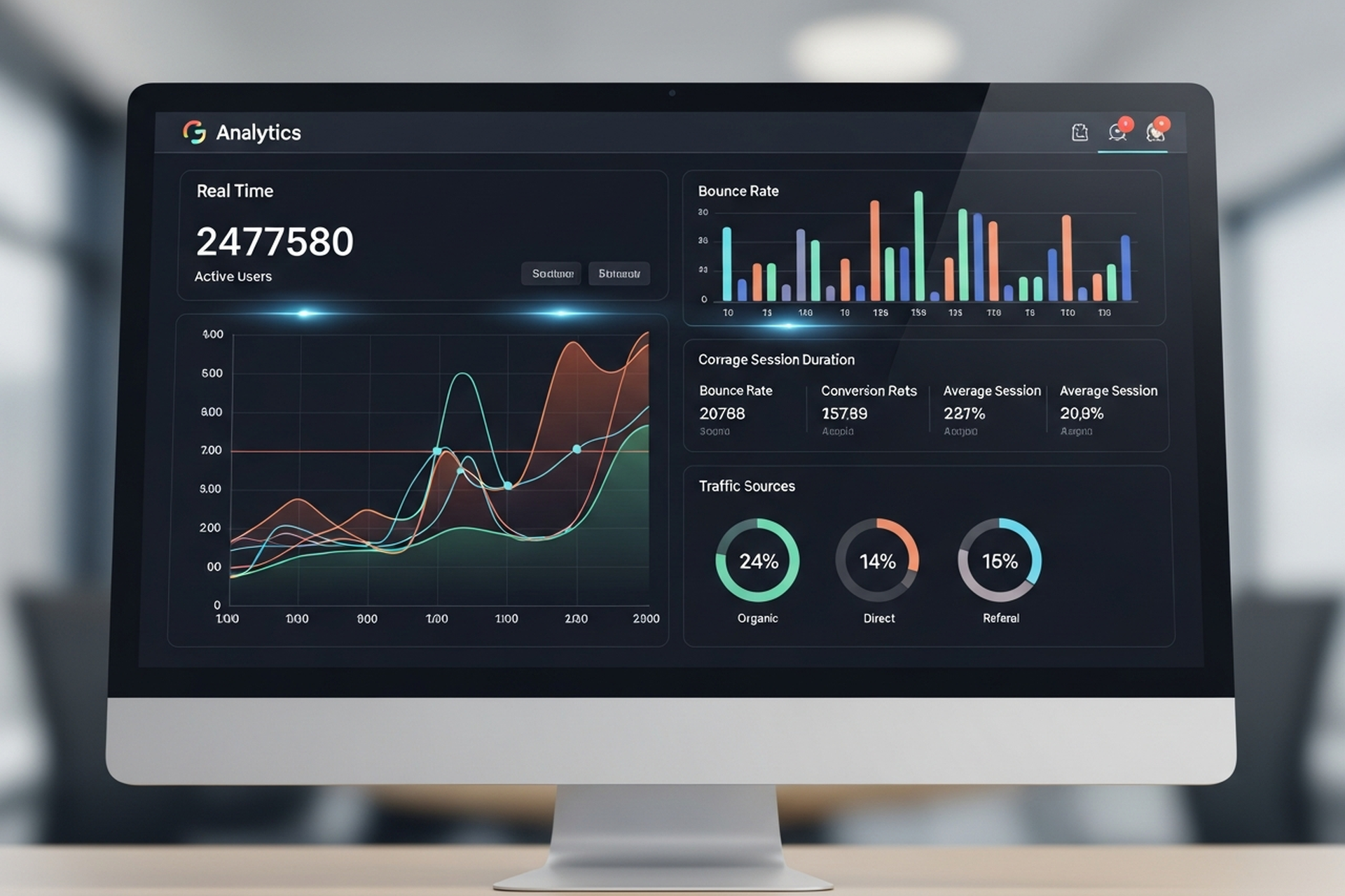
Most teams that say they "use analytics" are really just watching numbers change. They check traffic each Monday, glance at bounce rate, and feel vaguely informed. The data is there — they're just not asking it the right questions.
Analytics in web marketing is a discipline, not a dashboard habit. Done well, it tells you which channels are actually driving revenue, where your funnel breaks down, what visitors are doing before they convert (or don't), and which pages are dragging down your overall performance.
This guide covers what you need to know to build an analytics practice that informs real decisions — from the foundational metrics worth tracking, to the tools most commonly used, to the implementation details that most teams skip.
Web analytics has never been more accessible. Google Analytics 4 is free, most CMS platforms include built-in stats, and there's a tool for every layer of user behavior.
The gap isn't in access to data. It's in what most teams do with it.
The three most common failure modes:
Tracking everything, acting on nothing. More dashboards don't create better decisions. Teams that measure 40 metrics simultaneously are often less decisive than teams tracking five well-defined KPIs with clear action thresholds.
Confusing correlation with causation. Traffic goes up the same week you send an email campaign. Organic rankings improve after a site redesign. These might be related, or they might not. Drawing conclusions without properly structured attribution creates false confidence and poor spending decisions.
Ignoring the implementation layer. Analytics is only as accurate as its setup. Misconfigured conversion tracking, duplicate pageview events, missing UTM parameters, and unfiltered internal traffic are all common problems that silently corrupt your data.
There are dozens of web analytics metrics. Most teams track too many of them. Here are the ones that connect most directly to business performance:
Understanding where traffic comes from and whether that source is growing or declining is the starting point for any channel-level decision.
Engagement metrics tell you whether your traffic is qualified. High traffic with low engagement is often a sign of poorly targeted acquisition, misleading meta descriptions, or content that doesn't match search intent.
Conversion metrics are where analytics connects to business outcomes. They're the most important category and often the most poorly configured.
Still the default for most organizations. GA4 is free, integrates with the full Google marketing stack (Google Ads, Search Console, BigQuery), and has solid machine learning-powered insights built in.
The major shift from Universal Analytics (its predecessor) is the event-based data model. Every interaction is now tracked as an event rather than a pageview or session, which enables much more granular behavioral analysis — but also requires more deliberate implementation to configure correctly.
GA4's built-in AI surfaces automated anomaly detection and predictive audiences, which can flag significant traffic changes before you notice them manually.
GA4 is the standard starting point for most organizations regardless of what else is in the stack.
Where GA4 tells you what is happening in aggregate, Hotjar (and its free alternative, Microsoft Clarity) shows you why at the individual session level. Session recordings, heatmaps, and click maps reveal exactly how users are navigating your pages — where they're clicking, where they're stopping, what they're ignoring.
This behavioral layer is essential for conversion rate optimization. Quantitative data from GA4 tells you a page has a high exit rate. Qualitative data from Hotjar shows you that users are rage-clicking a button that doesn't work on mobile.
For SaaS products and apps, standard web analytics misses most of the interesting data — which features are being used, where users drop off in onboarding, what actions predict retention. Mixpanel and Amplitude are event-based product analytics platforms built for this depth of behavioral analysis.
Both track events at the user level (rather than the session level), which means you can analyze the paths individual users take through your product — not just aggregate traffic patterns.
Data lives in multiple systems — GA4, Google Ads, Facebook Ads, your CRM, email platform. Looker Studio connects these sources into unified dashboards, so you're looking at the full picture rather than switching between tools.
The value isn't in the tool itself but in the unified view it enables: revenue by channel, CAC by campaign, and funnel performance from first touch to close — all in one place.
The biggest analytics problems aren't conceptual — they're technical. Here are the implementation details that most teams get wrong:
Every conversion event on your site should be explicitly defined and verified before drawing conclusions from the data. Form submissions, button clicks, purchases, and demo bookings should each fire a distinct, measurable event — not a generic "page viewed" trigger.
In GA4, verify that your key conversion events are marked as such in the platform. Then test them manually: submit a form, complete a purchase, click a CTA button. Confirm the events fire correctly in the GA4 realtime report.
UTM parameters are how analytics platforms identify the source, medium, campaign, and content of your traffic. Without consistent UTM tagging on all marketing links — email campaigns, social posts, paid ads, partner links — your source attribution becomes unreliable.
The biggest UTM mistake: inconsistent naming conventions. "Email" and "email" are treated as different sources in GA4. "paid_social" and "Paid-Social" will split your data. Define a standard and enforce it across every team that creates tracking links.
If you're on the same IP address as your team, your visits to the site are inflating traffic data and corrupting conversion rates. Filter internal traffic in GA4 by defining internal IP addresses as filters, or by setting an internal traffic property.
This is particularly important for small companies where internal browsing represents a meaningful percentage of total sessions.
If your website and checkout, booking system, or community platform live on different domains, sessions will break between them unless cross-domain tracking is properly configured. A visitor who lands on your main site and checks out on your ecommerce subdomain will appear as two separate users unless the domains are linked in your GA4 configuration.
Analytics tools are infrastructure. The practice is what you do with them.
A few principles that distinguish teams that genuinely use analytics from teams that just have it installed:
Tie every dashboard to a decision. Before adding a metric to your reporting, ask: what decision does this data inform? If you can't answer that, the metric probably doesn't belong in your weekly review.
Establish baselines before drawing conclusions. Knowing your current conversion rate is 1.8% tells you nothing without context. Knowing it was 2.1% last month and 1.4% six months ago gives you a trend to act on.
Use analytics to generate hypotheses, not to confirm assumptions. The most valuable use of behavioral data is to surface unexpected patterns — pages that convert better than expected, traffic sources you weren't investing in, content that drives outsized engagement. These anomalies are where growth opportunities hide.
Separate reporting cadences. Weekly dashboards for operational metrics (traffic, conversion rate, ad spend efficiency). Monthly reviews for channel-level trends and budget decisions. Quarterly analysis for strategic pivots and benchmark comparisons.
Analytics in web marketing is the infrastructure that connects activity to outcomes. Without it, you're spending budget based on intuition and reporting performance based on impression. With it, you can identify exactly which channels, pages, and content types are generating revenue — and make decisions with proportional confidence.
The tools are accessible. GA4 is free. Hotjar has a free tier. Looker Studio is free. The barrier isn't cost — it's configuration and discipline.
Set up tracking correctly before you scale anything. Define the metrics that connect to your business goals rather than the ones that look good in a deck. Review data regularly with specific decisions in mind. And treat anomalies as opportunities, not noise.
Web analytics done well doesn't just tell you what happened. It tells you what to do next.


.svg)